Transitions in SwiftUI
What makes an app delightful? Everyone has a different opinion but when you perform an interaction, the transition needs to be smooth. It has to respond quickly. It must make use of the behaviours that are part of the system. When Apple introduced iOS 13 in 2019, they introduced a change to the way that modals get presented. Gone are the days of a modal covering the entirity of the screen, now is the time of a sheet. A sheet is slightly different in that it is presented almost to the top of the screen. This is a good change and one that allows for the user to understand a part of the app is presented over another and is meant to be a short lived interaction which can be dismissed at will to get back to the main content of the app.
So what if this isn’t the behaviour we want? What if, we want to change the users context from A to B without the ability to dismiss B to get back to A? Well, that’s a bit more complex. We need to get a little bit fancy. So, sit back, relax with a drink, place on your favourite record and lets explore what’s involved in creating this interaction.
To understand the structure of the views, we’ll take a look at the hierarchy of the views involed. In this article, we’ll be using SwiftUI. First up, let’s look at the canvas we’ll be displaying things on.
ZStack(alignment: .center) {
  Text("Hello world")
}
.edgesIgnoringSafeArea(.all)
This places a view on the screen that is extended to the absolute edges of the screen. It ignores the safe area insets. But this is just a single view that’s representing our main app context. The A state. Now lets add in our B state. The modal that covers all of A.
ZStack(alignment: .center) {
  Text("Hello world")

  ZStack(alignment: .center) {
    Text("You're awesome")
  }
  .frame(maxWidth: .infinity, maxHeight: .infinity)
  .background(Color.blue)
  .edgesIgnoringSafeArea(.all)
}
.edgesIgnoringSafeArea(.all)
Here we have the second ZStack covering all of the first. But there’s no interactivity between the two. They are simply layered on top of each other. In order to have the B state displayed as a result of an interaction, we must introduce some state. This is done by using the @State property wrapper around a boolean. This will give us our show / hide behaviour of the B state. It looks like the following:
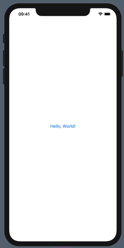
struct ContentView: View {
  @State var isPresented: Bool = false
  var body: some View {
    ZStack {
      Button(action: {
        self.isPresented.toggle()
      }) {
        Text("Hello, World!")
      }

      if isPresented {
        ZStack(alignment: .center) {
          Button(action: {
            self.isPresented.toggle()
          }) {
            Text("Dismiss modal!")
              .foregroundColor(.black)
          }
        }
        .frame(maxWidth: .infinity, maxHeight: .infinity)
        .background(Color.blue)
        .edgesIgnoringSafeArea(.all)
      }
    }
  }
}
This gives us our show / hide of the view but it doesn’t include any delight. There’s no animation. There’s no transition. It just appears, then it disappears. The tap of the screen, the instantaneous change. Nothing smooth about it. We are provided with some handy view modifiers which give us control over these behaviours. These modifiers are .animation and .transition.
Let’s explore these modifiers a bit. First, .animation. What this provides us with is the timing curve over which a view is changed. Apple’s documentation provides us with a list of the properties and functions that can be applied. There’s also a well written tutorial that steps through the behaviour from apple. There’s also a great article from Paul Hudson on hacking with swift about it as well.
So what does that give us? It lets us say at what speed we would like the view to be animated in and out. If we want to get fancy, we can even specify a spring animation very similar to what is available in UIKit.
Adding .animation to our view is only part of the solution. We also need to say how we want the transition to happen. This modifier takes an AnyTransition type that specifies the style of transition. There are a lot of predefined options here. These even include the ability to combine transitions and have a different transition for insertion and removal. The transition we are after is move and we want it to happen from the bottom edge. This is .move(edge: .bottom). Placing all of these together we get a view like the following.
struct ContentView: View {
  @State var isPresented: Bool = false
  var body: some View {
    ZStack {
      Button(action: {
        withAnimation {
          self.isPresented.toggle()
        }
      }) {
        Text("Hello, World!")
      }

      if isPresented {
        ZStack(alignment: .center) {
          Button(action: {
            withAnimation {
              self.isPresented.toggle()
            }
          }) {
            Text("Dismiss modal!")
              .foregroundColor(.black)
          }
        }
        .frame(maxWidth: .infinity, maxHeight: .infinity)
        .background(Color.blue)
        .edgesIgnoringSafeArea(.all)
        .transition(.move(edge: .bottom))
        .animation(.easeInOut)
      }
    }
  }
}
There we have it, we now have an overly simplified way of presenting a modal view full screen using an animation that comes up from the bottom of the screen and disappears in the same mannor.
We are able to see that it’s very easy to add a delightful animation and transition to the presentation of a view. From here, we hope you go and create some amazingly beautiful products that bring a lot of delight to users. If you’re after help with that, please get in touch using the social links at the bottom of this page.